“Unbelievable jobs numbers…these Chicago guys will do anything…can’t debate so change numbers.” So read the ‘tweet’ that the media immediately labeled a ‘conspiracy theory’, leading in short order to former GE CEO Jack Welch’s resignation as business correspondent from Reuters News.
Publicily accusing the US president or his advisors of deliberately fudging economic data for political purposes is a serious act, one certain to draw a response from the media. But as is so often the case, the response this time was primarily to remark at how outrageous the claim supposedly was, rather than to examine the evidence in any detail. This was as true on the ‘right’ side of the media spectrum as on the ‘left’. Take, for example, this response from the prominent conservative ‘think-tank’, the American Enterprise Institute (AEI):
There’s no interference with the Bureau of Labor Statistics numbers. The White House didn’t lean on the BLS and influence them to kick the unemployment rate below 8 percent. That talk should be confined to crazytown.[1]
OK, let’s suppose the AEI knows how things work in Washington. But then consider the following excerpt from the same article:
This month’s household survey is puzzling when viewed in light of the payroll survey and indicators for the broader economy. The headline unemployment rate fell from 8.1 percent to 7.8 percent, despite the fact that the labor force increased by 418,000. There were a whopping 456,000 fewer unemployed this month than last, and an incredible 873,000 more employed. The employment-to-population ration edged up by a solid 0.4 percentage points.
Ah, so the data were ‘puzzling’ and ‘incredible’—not believable. So perhaps the only way to reconcile the two excerpts above is to draw the conclusion that, while the AEI apparently knows that the data were not deliberately manipulated, they are, sadly, some combination of inaccurate and unreliable rubbish.
Am I being too harsh? Well, much US labour market data are not particularly ‘hard’ but based on surveys, estimates and models rather than on real numbers. Most of the data are published in incomplete form and subject to large revisions, both in the following months and in the annual, so-called ‘benchmark’ revisions. Indeed, the final estimates of labour market data, when they become available over a year later, frequently show quite a different picture than the original flash estimates.
In this instance, I doubt the AEI or other keen observers would be surprised in the event that the September 2012 headline unemployment rate is eventually revised back up to 8% or higher. It makes one wonder just what all the fuss is really about or why financial markets tend to respond with such vigour to flash labour market data headlines. Perhaps the market-markers who benefit from meaningless volatility actively encourage their casino clients to roll the dice on the first Friday of the month. They do, after all, employ legions of expensive economists to forecast these somewhat random numbers.
Leaving data veracity or reliability aside for the moment, lost in most of the discussion around Mr Welch’s tweet is the background of the current labour market situation in the US. It is not good. Keep in mind that the ‘headline’ unemployment rate, even if accurate, does not give a remotely full picture. This is because it is a narrow measure of unemployment, excluding ‘underemployed’ part-time workers, so-called ‘discouraged workers’ not seeking work, or those who have left the workforce entirely. Common sense tells us that some portion of part-time workers would in fact prefer full-time work; that some ‘discouraged workers’ would jump at a job if offered up to them; that some who leave the workforce do so because they don’t consider themselves employable, but would seek jobs if they changed their minds.
Well, the ‘U6’ unemployment rate includes part-time workers looking for full-time work and discouraged workers. In September, this rate was 14.7%, nearly double the headline rate and one representing a far larger portion of the workforce. And what of the workforce itself? Well, according to the BLS, the workforce increased by 418,000 last month.
That sounds a rather large number. But let’s place it in context. Over the past two years, rather than growing with the population, the workforce has in fact shrunk as an unprecedented number of workers have stopped seeking work. Since 2008, the participation rate has declined from over 66% to under 64%, the lowest level since the early 1980s, when a far smaller number of women worked full-time. (It is possible that some portion of these folks do in fact continue to work in an informal capacity, say for cash-in-hand, a simple way to avoid payroll and other taxes that make low-paid work uneconomic.)
Finally, let’s consider some ‘hard’ economic data that should have a strong relationship with the state of the labour market. Regardless of whether people are unemployed, or only employed part-time, or simply work odd-jobs for cash in hand, presumably the usage of food stamps—government-supplied coupons redeemable only for food—should correlate well to the general health of the labour market. Food stamp usage data are not estimated and subsequently substantially revised the way labour market data are. It is a real figure representing a real budget item. When jobs are scarce, food stamp usage should rise, and vice-versa.
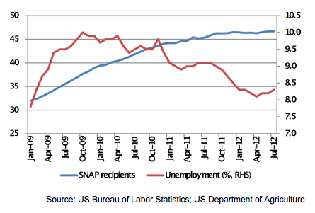
Well, guess what? Even though the headline unemployment rate has declined somewhat over the past two years, from 10% to under 8%, food stamp (SNAP) usage has soared, from 32mn to 47mn, a record high, and over 15% of the US population! Yes, the official headline unemployment rate might get more attention, but does it really tell us much about the general availability of living wages, or rather the lack thereof, for US households? Have a look:
DOES HEADLINE UNEMPLOYMENT SHOW A MISLEADING PICTURE OF THE ECONOMY?
Let’s return for a moment to Mr Welch’s tweet: Whether such a narrow, unreliable statistic is ‘manipulated’ or not is borderline irrelevant. A look at a broad data set shows that labour market conditions are far worse than the headline unemployment rate implies. But what if, in fact, the bulk of headline US economic data were, in fact, also somewhat misleading, if not necessarily manipulated? Should we be confident that we are getting a full, accurate picture of the real state of the economy?
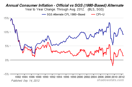
Some educated, experienced observers think not. I have previously cited the work of economist John Williams, who at www.shadowstats.com maintains a database of alternative methodologies for calculating not just US unemployment, but also consumer price inflation (CPI) and gross domestic product (GDP). He is not just making these data up. His methodologies are in fact based on how various US government agencies used to calculate the data in years past, before these methodologies were modified in some way. Here, for example, is what the CPI has looked like in recent years based on the old methodology:
IS PRICE INFLATION ACTUALLY NEARLY 10%?
AND IS UNEMPLOYMENT OVER 20%?
And here is a look at how things in the labour market look today using the old methodology for calculating the broad unemployment rate:
If official inflation is understated, this implies that real GDP growth is overstated, that is, much of the ‘growth’ being measured is merely ‘nominal’—price inflation—rather than ‘real’. (I elaborate on why I think GDP is a poor measure of growth in my book, The Golden Revolution. Follow it—and me—on Twitter.)
Readers take note: The way in which the government has changed the calculation of official economic data through the years has always, in each and every instance, made the US economic situation appear healthier than when using the previous, ‘inferior’ methodology. Coincidence? Decide for yourself. But be careful what you tweet, lest you be labelled a statistical ‘conspiracy theorist’.
[1] The link to this article can be found here.
This article was previously published in The Amphora Report, Vol 3, 16 October 2012.


Rick S. predicted that this would be done (and he predicted it well in advance) live on CNBC.
Accepted that Rick S. predicted it would be “7.9%” so the regime could claim that unemployment had gone below 8% – instead they declared “7.8%” (they might as well have said there is no unemployment at all).
“But this is a independent Civil Service thing” – contrary to what is taught, “Civil Service” does not mean “objective” it just means the left control things (automatically – without even having to work via appointments).